In 1994, Japanese designer Kenya Hara asked a group of architects to come up with alternate designs for pasta, keeping in mind a few basic rules: the pasta needed to have an even surface area to allow for uniform heat transfer and a shape that allowed the sauce to stick. The architects came up with some beautiful designs that were duly exhibited to much acclaim. But no pasta company asked Kenya Hara for a license on any of the innovative designs. “It turns out we could not beat the pasta shapes that have been handed down through the ages. But the idea behind this project was the core of my design philosophy: make known things unknown and then visualise alternatives.”

Brought to Ahmedabad by Reliance Brands, Kenya Hara attracted a huge audience to the new BNB Lecture Hall at CEPT University on Thursday. His hour-long talk covered his three-decade design journey, which has led to the creation of Muji, one of Japan’s most successful retail brands. In line with Harasan’s design philosophy, Muji is best known for adding a fresh twist to the most commonplace household objects: brooms, cutlery, clothes clips, sofas. “A boring product can be transformed by the power of a talented designer,” he said. “The essence of design is laughter. That way, even brooms can give us pleasure.”

Kenya Hara believes that complicated designs were used by royalty as a symbol of power. The Taj Mahal, with its elaborate carvings, is a case in point. “The era of kings is over. Designers now prefer simplicity and functionality. But frugality is not inferior to luxury. At Muji, we are proud of our frugal designs,” he says.

One of Kenya Hara’s favourite materials is paper, which lends itself to infinite possibilities, especially in packaging. His lecture was accompanied by some fascinating visuals, such as the packaging that Muji has developed for a single mango, which makes sure it is not damaged in transit and would be presented to the buyer in a style befitting such a precious fruit.

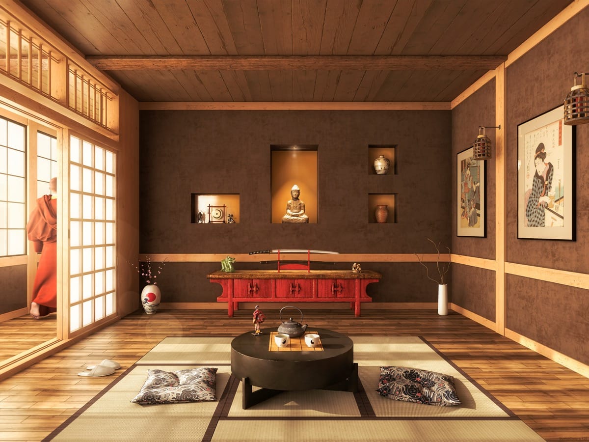
The Japanese aesthetic has always favoured frugal design. Kenya Hara gives the example of a tea room, which is like an empty theatre, with just a table for the tea pot and cups. “When you add cherry blossoms to the tea, it is as if a tree of cherry blossoms occupies the empty spaces. Emptiness is most important to the Japanese aesthetic. It is an emptiness that can possibly be filled with anything,” he said.
In an age when different cultural influences are coming together in the design cauldron, we need to ensure the emerging colour is not a dull, uniform grey. “We need to retain the colours of different cultures, make sure they shine,” said Kenya Mara.
Also Read: Dalit Man Forced to Hold Businesswoman’s Footwear in His Mouth, Gujarat Police Files FIR


